Sciencesconf is starting the year in style by rolling out its brand-new, more modern and user-friendly interfaces, designed to make your upcoming conference websites more appealing. They are optimised for mobile phones and tablets, providing smooth, intuitive navigation for all users, regardless of the device. These interfaces are available for all newly created conferences.
Whether you are registering for a Sciencesconf-hosted conference (tip: the conference website address contains sciencesconf.org), submitting a paper or managing your conference website, the platform now offers screens better suited to current usage patterns.
The first phase of this global ergonomic redesign focuses on conference websites, including:
- homepage,
- program browsing,
- access/map page,
- customizable pages,
- registration,
- paper submission.
The new ergonomics are only available for screens in conferences that have been created after these new interfaces went live.
The homepage: the visual identity of your conference
Three themes are available to personalize your website. They were created by a web designer and are intended to provide a coherent visual atmosphere.
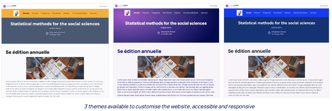
These templates fit into a consistent framework that makes Sciencesconf easily identifiable, following the same principles applied to the HAL portals and Episciences journals. All sites share the same header banner (above the customisable header) and an identical, non-modifiable footer.
Accessible and mobile-responsive interfaces
Each HTML page is optimised to meet RGAA4 accessibility standards. Therefore, when configuring pages, it is important to adhere to the provided guidelines.
Designed for use on mobile phones and tablets, these interfaces offer optimal navigation, regardless of the device used. There was particular demand from users for the ability to comfortably display and consult the programme on a smartphone, whatever its level of complexity, and this was a key objective of the redesign project.
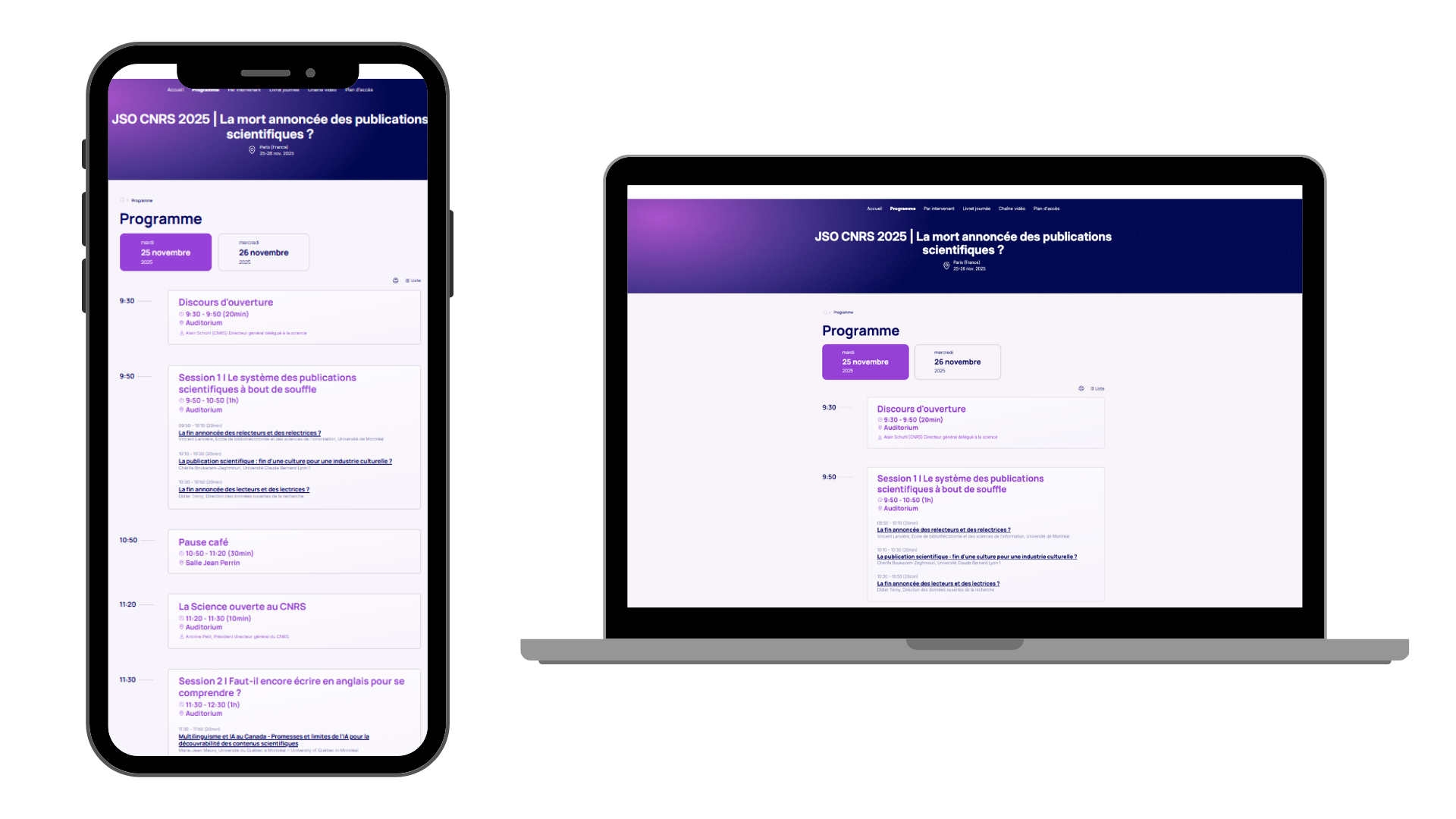
Programme display: viewing on mobile devices and computers
Coexistence of two ergonomics
One of the project’s constraints was that it should not impact existing websites. This required maintaining both versions of the interfaces for several months. Consequently, if you register for a conference now, it is unlikely that you will immediately encounter these new, more modern screens.
The project, launched in January 2025, will continue in 2026 with the redesign of administration screens intended exclusively for organising teams.