As HAL celebrates its 20th birthday, the CCSD and its services get a new brand identity. New logos, new brand architecture and new visual concept: its a full makeover!
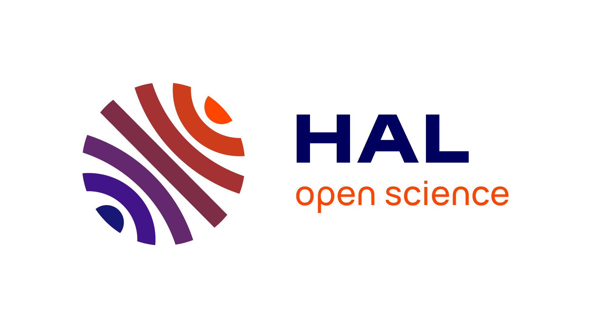
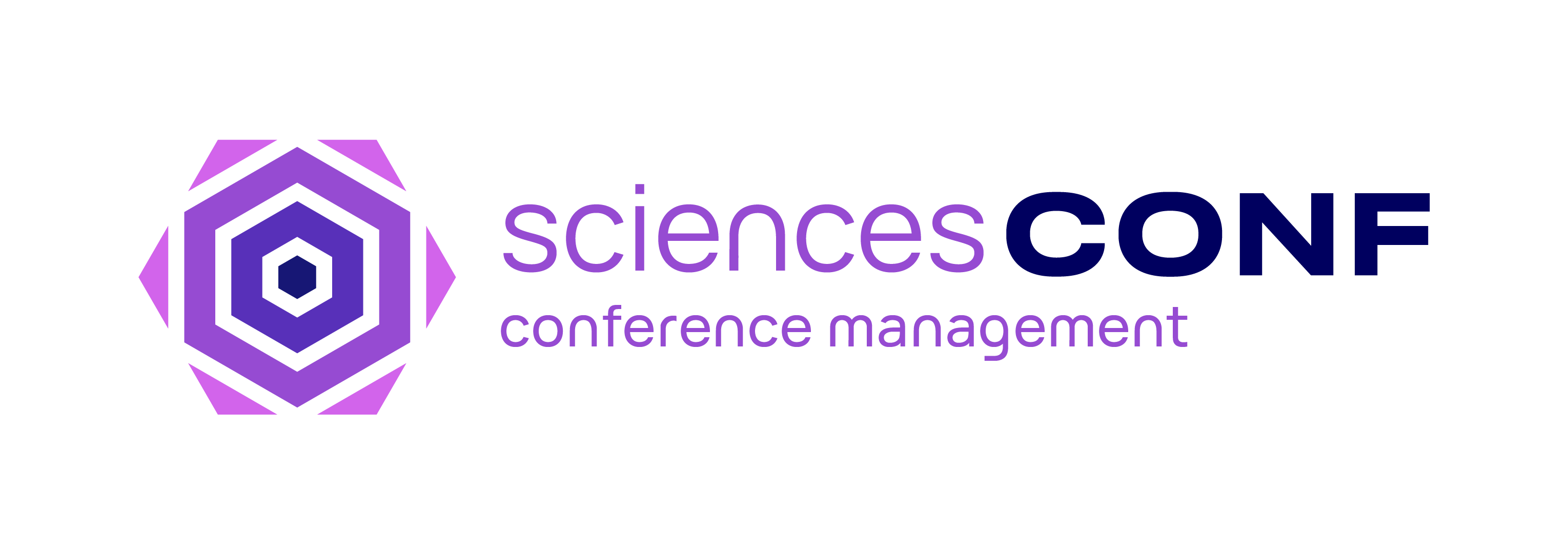
The new logos of HAL, Episciences and Sciencesconf make the whole: the signs relate to specific features of each service, all the while being based on a common visual principle. HAL’s symbol is a bright orange planet evoking the pooling and dissemination of knowledge; as for Episciences, the cyan square brings to mind the scientific precision of the peer review process; finally, Sciencesconf’s purple hexagon reminds of a meeting point for sharing information. These signs are made of bright dynamic colours gently equilibrated in a consistent whole.
 |
 |
 |
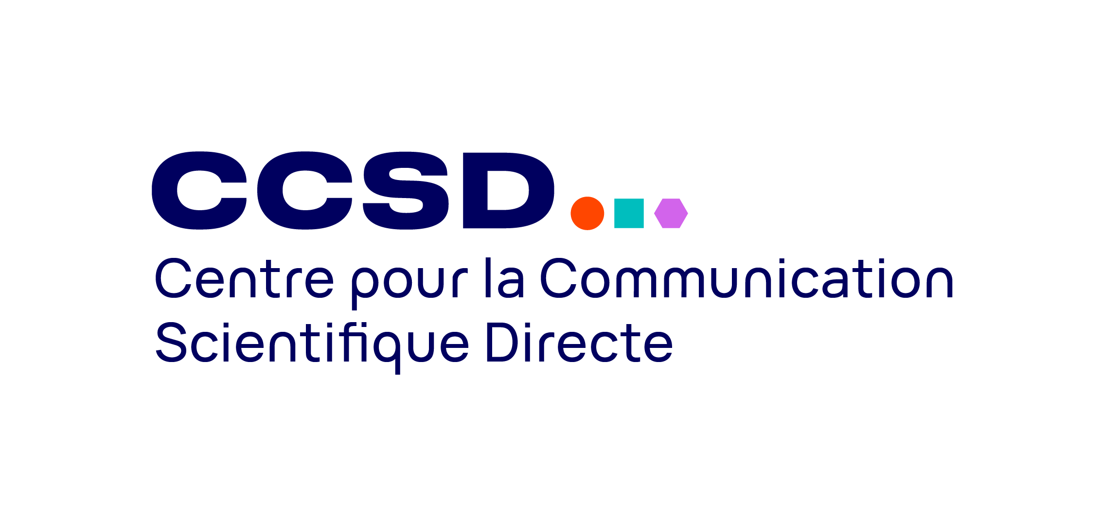
The logo of the CCSD gathers together these services, which are the reason of its existence, by putting forward the shapes and colours of each platform. The institutional blue acts as an assemblage point for the logos, as it is the starting point of each gradient.
The logos for HAL’s thematic archives inherit from main one: the orange planet, now in plain colours, represents HAL-SHS, mediHAL and HAL theses. The later was formerly known as TEL; this rebranding aims to emphasize the nature of the thesis open archive in relation to HAL: it is a part of HAL, and any submission to HAL theses is a deposit in HAL.
 |
 |
 |
All these logos as well as the identity and style guide book are already available on the Brand guidelines page.
Coloured and full size versions are to be privileged.
If you have any additional need regarding the brand identity or the use of the logos, please contact the CCSD’s communication team: communication[at]ccsd.danka.work
The project
This project, initiated in late 2020, originates from the assessment that the former logos of HAL, Episciences and Sciencesconf lacked consistency. The brand identity of the CCSD and its services was weak and hard to single out. The visual unity did not follow the growth in importance of the platforms, and specifically HAL which together with Episciences and Sciencesconf is listed in the research infrastructure roadmap of the Ministry of Higher Education, Research and Innovation. The brand identity had to contribute to matching this ambition and highlight the CCSD as a key pillar of this infrastructure.
(Re)-thinking the brand architecture thus became a necessity. It is also an opportunity to offer these booming platforms more remarkable and coherent logos. After considering a few branding agencies, bringing in Graphéine provided us with the best combination of talent to help the CCSD with the task?.
After having analysed requirements for the new brand platform, the graphic designers came up with new logos and a colour scheme showcasing HAL, Episciences and Scienceconf, and last but not least, a logo for the CCSD that conveys our consistent brand architecture, in which the CCSD is a structuring institutional force that contributes to the vibrance of the open science movement. The colours picked connect the past and the future since they hint to the former hues: the institutional blue is pretty much the same as the one having been used in HAL’s colour theme up until now, and so is the new HAL orange; the cyan chosen for Episcience is a more dynamic variation of the previous green. Hence, the logos HAL, Episciences, Sciencesconf and the CCSD make up the continuity of the platforms and will drive its growth for years to come.
The new brand identity goes well beyond the logos and color scheme as it includes a new visual concept and brings up layout principles for presentations and publications. The makeover also covers the web design for HAL and its portals, which goes in pair with the new HAL’s UX/UI design that will be rolled out in the following months.
Through this rebranding campaign, the CCSD aims to highlight its services for the open science, making the infrastructure more intelligible, thus inciting open science practices. Pursuing the same goals, the CCSD will renew its institutional website, as well as the ones for Episciences and Sciencesconf. Now enshrined in the new identity, they will convey in a straightforward and accessible manner their purpose and place in the higher education and research environment.