The goal of the new HAL Monitor consultation tool is to provide visuals that summarize HAL content based on selected criteria. The added bonus? They can be easily reused in your presentations or reports.
Data visualization tools help transform large and complex data sets into easy-to-interpret charts and graphs. This makes it easier to quickly identify trends. Data visualizations enhance your ability to communicate information clearly and concisely.
A user-friendly interface for exploring data
With this new interface, HAL offers a dashboard designed to be intuitive and easy to use. It is based on API queries based on reference data available in auréHAL (such as the auréHAL identifier for an ANR project or a research structure).
Reports are downloadable: you can retrieve visualizations (in PNG image format) and indicators (in CSV format) for later use or presentations.
HAL Monitor complements the search functionality; it does not provide access to deposits.
Example:
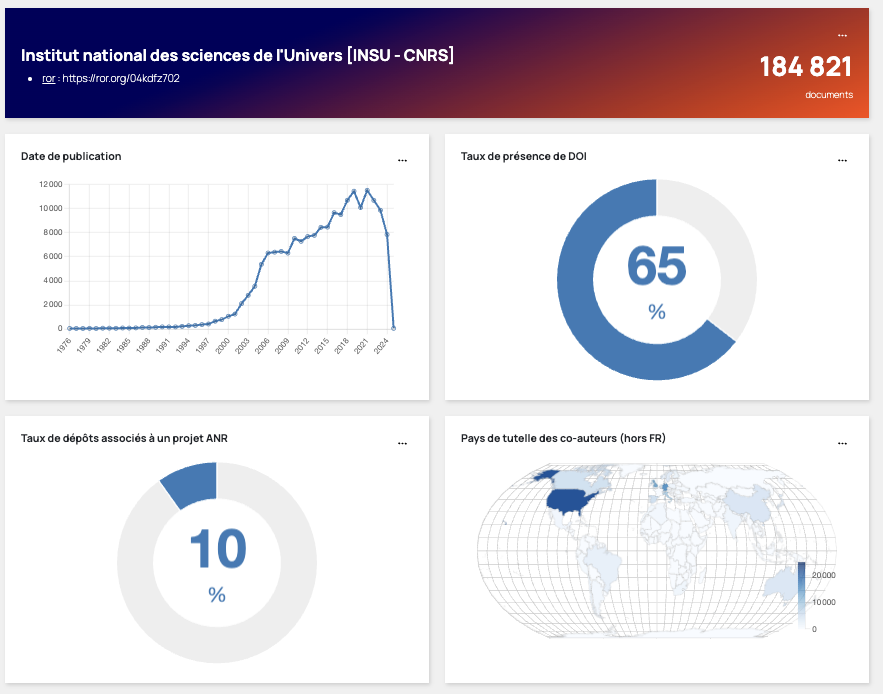
For example, you can visualize international collaborations on a map (showing the countries of the authors’ institutions) or track the evolution of deposits in a collection or research team (or research structure) over time. Whether you’re presenting data at a conference, writing a report, or sharing with colleagues, the dashboard’s visualizations make it easier to communicate information.
In practice
You specify the corpus you want to query (portal, collection, research structure, etc.), the time period, and you get:
- Open access rate: Total deposits of files and records with open access links
- Deposit breakdown: Deposits with files, with annex files and without files
- Distribution by scientific discipline
- Distribution by document type
- Distribution by publication language
- Distribution by licenses
- Distribution by year of publication
- Distribution by year of deposit
- Percentage of deposits with a DOI identifier
- Percentage of deposits submitted by an author (self-archiving rate)
- Percentage of deposits associated with an ANR project
- Percentage of deposits associated with a European project
- Top journal titles
- A map summarizing international collaborations (based on the countries of co-authors’ institutions outside France)
- A keyword cloud
- Percentage of submissions completed with “associated data” metadata.
Data visualizations enhance the ability to communicate information clearly and concisely. They present statistical data in a visually appealing and accessible way, which is especially useful for sharing insights and offers significant time savings.